SPL Programming - 12.2 [Drawing graphics] Coordinate system
To draw a graph, we must first establish the concept of coordinate system. We all learned some knowledge of plane analytic geometry and rectangular coordinate system in middle school. We know that all dots on the plane can be represented by coordinates. The same is true of computer drawing, which usually uses rectangular coordinate system to determine the position.
Different from the coordinate system we are used to, the origin of the canvas coordinate system is in the upper left corner, its Y-axis direction is from top to bottom, and the whole canvas is in its first quadrant.
Let’s try to draw a few dots with this coordinate system:
| A | B | |
|---|---|---|
| 1 | [50,100,150,200,250] | |
| 2 | =canvas() | |
| 3 | =A2.plot(“Dot”,“data1”:300,“data2”:50) | |
| 4 | =A2.plot(“Dot”,“data1”:A1,“data2”:A1) | |
| 5 | =A2.draw(400,300) | =A2.draw(600,400) |
The result is as follows:
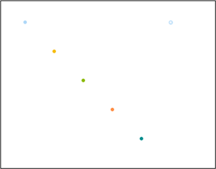
Obviously, the dot on the upper right is drawn by A3, and the row of dots on the left that can form a slash is drawn by A4. Why are the dots in this row drawn in different colors? We’ll explain later.
The plot() function can draw a single dot at a time or multiple dots at a time, as long as the coordinate value sequence is given. Data1 and Data2 correspond to the X-axis and Y-axis respectively. Note that if multiple dots are drawn, the two coordinate sequences should be of the same length.
You can try to use the plot() editing interface to change some appearance, such as the shape and color of dots.
The coordinate values are in pixels, so the results drawn in A5 and B5 are the same, both in the upper left part of the whole canvas, and the size is the same. However, we often want graphics to change with size (like the finished graph in the previous section), so it is not appropriate to use pixels as coordinate units.
SPL also provides relative coordinates. If the coordinate value is less than 1, it is considered as the proportion relative to the canvas, that is, the coordinate range of the whole canvas is within the [0,1] interval. Let’s try.
| A | B | |
|---|---|---|
| 1 | =10.((~-1)*0.1) | =A1.(~*~) |
| 2 | =canvas() | |
| 3 | =A2.plot(“Line”,“data1”:A1,“data2”:B1) | |
| 4 | =A2.draw(400,300) | =A2.draw(600,400) |
Now it can draw half a parabola, and B4 is larger than A4, realizing proportional scaling.
This time, line is used to draw. The dots in the figure are connected. You can change various appearance properties of the element by yourself. You can also choose not to draw dots.
In theory, with this coordinate system, we can draw any figure. Usually, the drawing mechanism that can be provided by a programming language that is not used for professional graphics can only provide the above content (of course, there will be some functions to complete complex composite actions). However, this is obviously inconvenient. Sometimes the drawing position is not exactly within the [0,1] range or the pixel range of the canvas, so you need to make some transformations yourself. Although SPL has strong computing power, it is not a problem to complete these things, but it is still a little troublesome.
Moreover, in the previous finished graphs, the parameters we passed to the element in the code are directly the region name and amount value, and it can draw very well. It will be much more convenient if we can draw like this.
When using pixel coordinates and relative coordinates to draw a graphic, we use a set of coordinate system that is inherent in the canvas, called physical coordinates. SPL allows programmers to draw with their own data as coordinate values, which requires the establishment of a logical coordinate system.
We know that a rectangular coordinate system always has two axes: the horizontal axis and the vertical axis. As long as the axes are determined, the coordinate system is determined. SPL uses this method to establish the logical coordinate system. Let’s look at the list of elements on the upper right of the element editing box. The first part is the axis. There are three types:
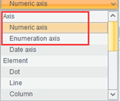
We select the first numeric axis and look at its properties, focusing on these:
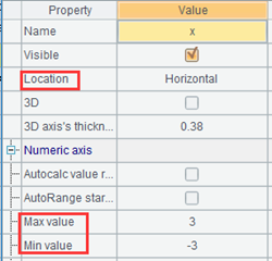
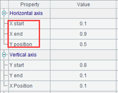
The three properties on the left indicate that it is a horizontal axis and the value range is [-3,3] (the default value is not this, but this is a property that can be modified, including the above two checked items, which are checked by default). The actual position of the axis is defined on the right. Because there are only physical coordinates when defining the axis, its position can only be described by physical coordinates. These 0.1, 0.9 and 0.5 are the relative coordinates mentioned earlier (these are not the default values).
Use the element editing interface to add an element to the code, use the property values in the figure above, and use the default values for unlisted properties. Note that you should also name this axis (the first row of the property list), which is called x here.
Similarly, add a vertical axis named y, set the range as [-3,3], and uncheck the two items above the range. The position of the axis is filled as 0.9, 0.1 and 0.5. Note that the position of the vertical axis should be filled in the property of the vertical axis in the lower half of the right figure, and the start is 0.9 and the end is 0.1, from large to small. In this way, the y axis can be made from bottom to top, which is in line with our habit.
Add a draw() after the generated code:
| A | B | |
|---|---|---|
| 1 | =canvas() | |
| 2 | =A1.plot(“NumericAxis”,“name”:“x”,“autoCalcValueRange”:false,“autoRangeFromZero”:false,“maxValue”:3,“minValue”:-3,“xEnd”:0.9,“xPosition”:0.5) | |
| 3 | =A1.plot(“NumericAxis”,“name”:“y”,“location”:2,“autoCalcValueRange”:false,“autoRangeFromZero”:false,“maxValue”:3,“minValue”:-3,“yStart”:0.9,“yEnd”:0.1,“yPosition”:0.5) | |
| 4 | =A1.draw(600,400) | |
Execute it and take a look:
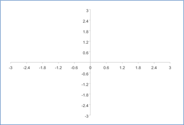
Sure enough, two axes are drawn. You can set various properties of the axis to control whether the scale and arrow are displayed.
Now let’s draw with the coordinate system determined by these two axes, and continue to write code:
| A | B | |
|---|---|---|
| 1 | =canvas() | =60.((~-1)*6*pi()/180) |
| … | … | |
| 4 | =B1.(2*cos(~)-cos(2*~)) | =B1.(2*sin(~)-sin(2*~)) |
| 5 | =A1.plot(“Line”,“axis1”:“x”,“data1”:A4,“axis2”:“y”,“data2”:B4) | |
| 6 | =A1.draw(600,400) | |
A5 uses these properties:
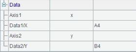
This indicates that the element drawn in A5 is positioned with two axes called x and y, and the coordinates of the dots to be drawn are in A4 and B4.
We succeeded in drawing this:
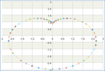
SPL graphics are mainly used to draw statistical charts for structured data. The default properties of these elements are not simple. For example, a dot will have different sizes to be seen clearly. Generally, the axis will have a scale, and there will be stripes by default when drawing the coordinate system. These can be adjusted by modifying properties, but after changing to non-default values, the parameters of the plot() function will be longer and inconvenient to be listed in the book, so we try to use the default properties, but it’s a little strange to draw the function diagram. However, this does not affect the understanding of knowledge points.
These axes defined by ourselves are called logical axes, while the original two axes of the canvas are called physical axes. When drawing an element, the drawing of the two axes means that the logical coordinate system established by these two axes will be used, and then we can use our more convenient values as coordinate values. If no logical axis is selected, it means that physical coordinates will be used, such as the graph at the beginning of this section.
The essence of the logical axis is to map the familiar business values into the coordinate values of the physical axis. After the axis is defined, the business values are used in graphic drawing. The logical axis is responsible for finding the correct position. After modifying the mapping relationship between the logical axis and the physical axis, the graphic drawing code does not need to be changed, and the graphics will be drawn in another way.
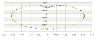
For example, we can move the y axis up a little, change its start and stop position to 0.5 and 0.1, and then try to let SPL automatically find the range of coordinate axis at the same time:
| A | B | |
|---|---|---|
| 1 | … | |
| 2 | =A1.plot(“NumericAxis”,“name”:“x”,“autoRangeFromZero”:false,“xEnd”:0.9,“xPosition”:0.5) | |
| 3 | =A1.plot(“NumericAxis”,“name”:“y”,“location”:2,“autoRangeFromZero”:false,“yStart”:0.5,“yPosition”:0.5) | |
To let SPL automatically calculate the coordinate axis range, check the first of the two items above the value range and leave the second unchecked. The value range can be left blank.
Now it’s drawn like this. There is only graphic in the upper part of the canvas.
SPL provides three kinds of logical axes: numeric axis, enumeration axis and date axis. This is divided by the data type of business data. The numeric axis is used when the business data is numeric, the enumeration axis is used when it is a sequence, and the date axis is used when it is a date type.
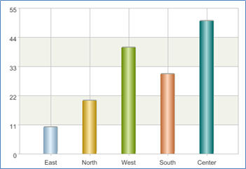
In the previous finished graph, the enumeration axis is used, and the area values are in a sequence. At this time, we can ask SPL to draw a column at the position with the abscissa of East and the ordinate of 10. As for the specific position of East corresponding to the canvas, it is solved by the logical axis. When writing the drawing code, just care about its business significance.
Let’s try to redraw the previous column chart using the logical axis.
| A | B | |
|---|---|---|
| 1 | [10,20,40,30,50] | [East,North,West,South,Center] |
| 2 | =canvas() | |
| 3 | =A2.plot(“EnumAxis”,“name”:“area”) | |
| 4 | =A2.plot(“NumericAxis”,“name”:“amount”,“location”:2) | |
| 5 | =A2.plot(“Column”,“axis1”:“area”,“data1”:B1,“axis2”:“amount”,“data2”:A1) | |
| 6 | =A2.draw(600,400) | |
A3 creates the enumeration axis as the horizontal axis, named area, and other properties use the default values; A4 uses a conventional numeric axis as the vertical axis, named amount, and also uses the default properties. Then A5 draws a graph in the logical coordinate system established by the two axes with the data of A1 and B1.
There is still a problem. Now that the order of these columns from left to right is the order of the data in B1. If we want to change the order, or if there are some regions that do not appear in the business data, but still want a position in the graph, do we have to modify the business data in B1?
No, how to find the physical position should be the task of the axis, which has nothing to do with the business data.
Change the code:
| A | B | |
|---|---|---|
| 1 | [10,20,40,30] | [East,North,West,South] |
| 2 | =canvas() | [East,North,Center,West,South] |
| 3 | =A2.plot(“EnumAxis”,“name”:“area”,“categories”:B2) | |
| … | … | |
We deliberately fill in one less data of A1 and B1, but there is a complete region sequence in B2. When A3 establishes the enumeration axis, fill its “categories” property as B2, and draw it again:
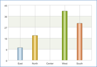
How to find the physical position is indeed the task of the axis, which has nothing to do with the data used for drawing. Only when the corresponding property of the axis is not filled in, SPL will automatically fill in one.
To sum up, SPL realizes the transformation from business data to physical position through the logical axis. If you understand this principle, the date axis is easy to understand (just converting the date into position). It is also easy to understand the properties of the logical axis element. For example, logarithmic and exponential transformation can also be done on the numeric axis. These contents no longer involve knowledge points, but specific syntax and editing schemes. Please refer to SPL documents when necessary.
SPL Programming - Preface
SPL Programming - 12.1 [Drawing graphics] Canvas and elements
SPL Programming - 12.3 [Drawing graphics] More coordinate systems
SPL Official Website 👉 https://www.scudata.com
SPL Feedback and Help 👉 https://www.reddit.com/r/esProcSPL
SPL Learning Material 👉 https://c.scudata.com
SPL Source Code and Package 👉 https://github.com/SPLWare/esProc
Discord 👉 https://discord.gg/2bkGwqTj
Youtube 👉 https://www.youtube.com/@esProc_SPL


