

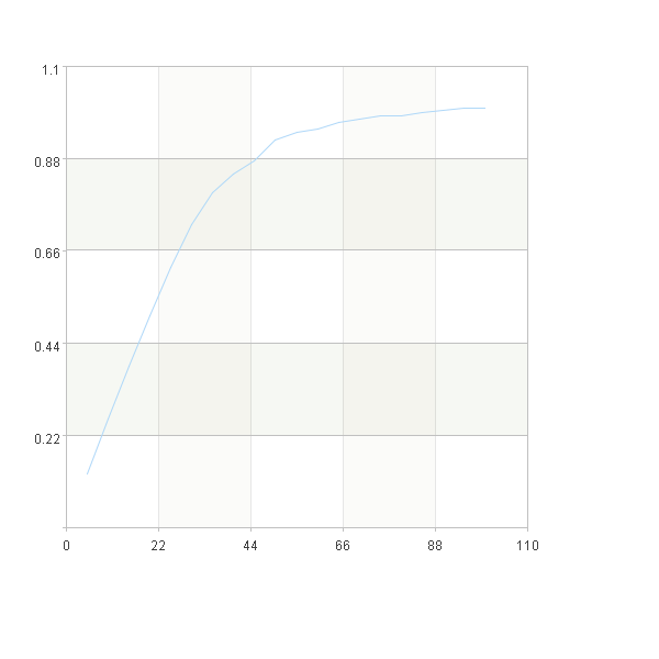
Recall curve
Recall curve shows when the model finds a positive sample, which is mainly used in scenarios where the data is unbalanced.
The recall curve is drawn in a similar way to the lift curve, except that recall rate = (the number of 1 in the group/the number of 1 in all)
A |
|
1 |
=file("D://titanic_export.csv").import@tc() |
2 |
=A1.select(Survived==1).len() |
3 |
=A1.sort@z(Survived_1_percentage) |
4 |
20 |
5 |
=ceil(A1.len()/A4) |
6 |
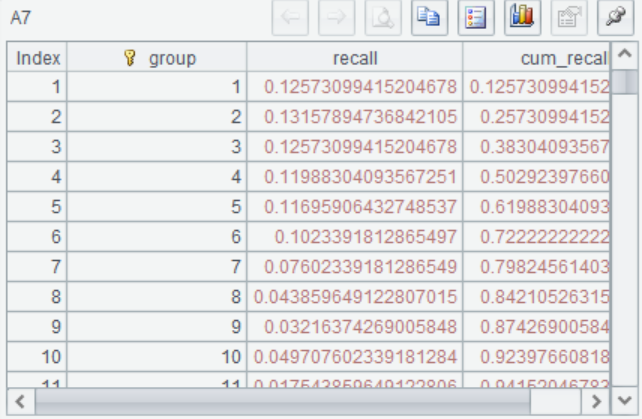
=A3.groups((#-1)\A5+1:group;count(Survived==1)/A2.select(Survived==1).count:recall) |
7 |
=A6.derive(recall+cum_recall[-1]:cum_recall) |
8 |
=canvas() |
9 |
=A8.plot("NumericAxis","name":"x") |
10 |
=A8.plot("NumericAxis","name":"y","location":2) |
11 |
=A8.plot("line","markerStyle":0,"axis1":"x","data1":A6.(group*100/A4),"axis2":"y", "data2":A7.(cum_recall)) |
12 |
=A8.draw@p(600,600) |
A2 Calculate the number of positive samples
A3 Sort the data in descending order according to the predicted probability value
A4 Set the number of groups N
A5 Calculate the number of samples within each group
A6 The sorted samples were grouped into A5 samples per group and brought into the formula to calculate the recall rate of each group
A7 Calculate the cumulative recall value
A8-A12 The percentage of sorted samples was taken on the X-axis, and the cumulative recall value of each group was taken on the Y-axis to draw the curve
SPL Official Website 👉 https://www.scudata.com
SPL Feedback and Help 👉 https://www.reddit.com/r/esProcSPL
SPL Learning Material 👉 https://c.scudata.com
SPL Source Code and Package 👉 https://github.com/SPLWare/esProc
Discord 👉 https://discord.gg/2bkGwqTj
Youtube 👉 https://www.youtube.com/@esProc_SPL