

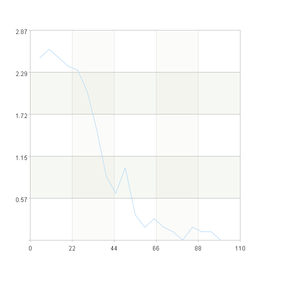
Lift curve
Lift is a measure to evaluate the effectiveness of a prediction model. Its value is the ratio between the results obtained with and without the prediction model.
The Lift curve is drawn as follows:
(1)Sort the data in descending order according to the predicted probability value
(2)The sorted data are approximately equal frequency divided into N groups
(3)Calculate the lift value within each group: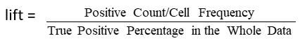
(4)Draw the lift curve with 1-N groups on the X-axis and lift values on the Y-axis
A |
|
1 |
=file("D://titanic_export.csv").import@tc() |
2 |
=A1.groups(Survived;count(~)/A1.len():ratio) |
3 |
=A1.sort@z(Survived_1_percentage) |
4 |
20 |
5 |
=ceil(A1.len()/A4) |
6 |
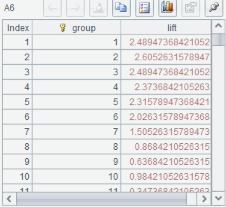
=A3.groups((#-1)\A5+1:group;count(Survived==1)/count(~)/A2.select(Survived==1).ratio:lift) |
7 |
=canvas() |
8 |
=A7.plot("NumericAxis","name":"x") |
9 |
=A7.plot("NumericAxis","name":"y","location":2) |
10 |
=A7.plot("line","markerStyle":0,"axis1":"x","data1":A6.(group*100/A4),"axis2":"y", "data2":A6.(lift)) |
11 |
=A7.draw@p(600,600) |
A2 The data were grouped according to the true value Survived, and the proportion of 0 and 1 in the total sample was calculated
A3 Sort the data in descending order according to the predicted probability value
A4 Set the number of groups N
A5 Calculate the number of samples within each group
A6 The sorted samples were grouped into A5 samples per group and brought into the formula to calculate the Lift value of each group
A7-A11 The percentage of sorted samples was taken on the X-axis, and the lift value of each group was taken on the Y-axis to draw the curve
SPL Official Website 👉 https://www.scudata.com
SPL Feedback and Help 👉 https://www.reddit.com/r/esProcSPL
SPL Learning Material 👉 https://c.scudata.com
SPL Source Code and Package 👉 https://github.com/SPLWare/esProc
Discord 👉 https://discord.gg/2bkGwqTj
Youtube 👉 https://www.youtube.com/@esProc_SPL